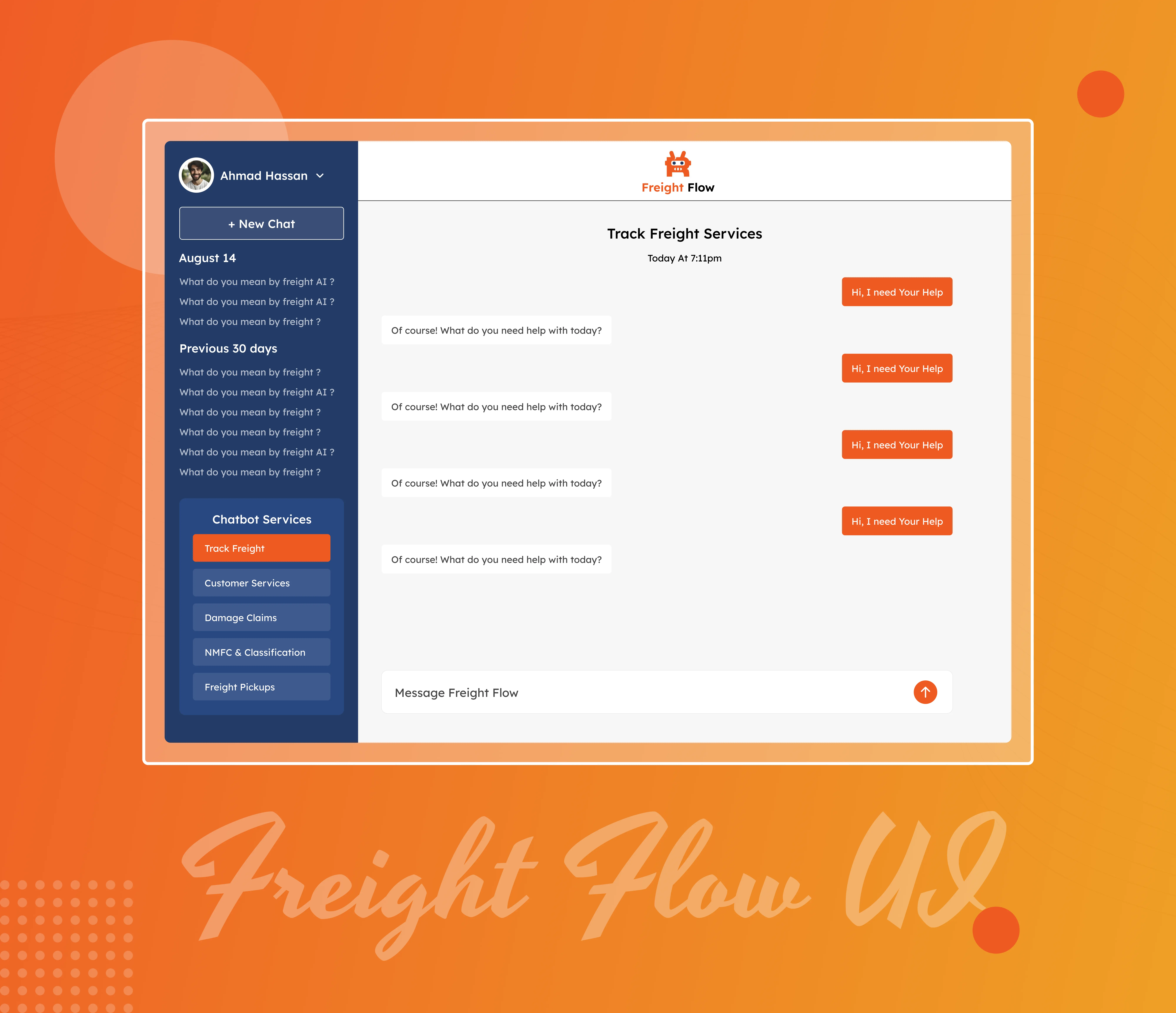
The Freight Flow Dashboard UI Design was crafted with the logistics industry's complexity in mind. Our design goal was to create a streamlined interface that brings clarity to freight management operations. We began by mapping out the core needs of dispatchers, drivers, and logistics managers to ensure the dashboard addressed real-world scenarios—like shipment tracking, status updates, and route management—without overwhelming the user.
We adopted a clean and modern layout that prioritizes usability. Key information such as active shipments, delivery status, and notifications were positioned for quick access, while the navigation was kept minimal yet powerful. Icons, color coding, and visual indicators were used to guide users intuitively through different actions and alert them to key events, all while maintaining brand consistency and a professional look.
Responsiveness was at the heart of our design. Whether accessed from a desktop, tablet, or mobile device, the dashboard maintains clarity and functionality. Each module—from analytics to user profiles—was designed to be modular and scalable, allowing the product to grow with future feature additions.
This UI design bridges the gap between operational needs and user experience. By simplifying complex data and integrating smart design patterns, the Freight Flow Dashboard empowers logistics teams to work more efficiently, make informed decisions, and improve the overall freight handling process.